Well sure I'm only on the second layout, but if you haven't been here before, this is what Rupert Grint Overload used to look like. I liked this layout, it was easy to get around, but it took forever to load. I originally used frames for it, but I changed to tables after a while and I really didn't like that, so I just made a new layout so I didn't have to use tables. I just didn't like the look of it. Click on the image to see the real size.

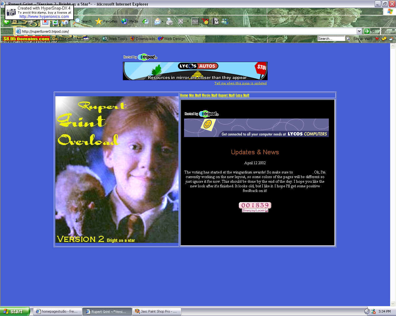
This was my second layout. It was called Bright as a Star, it was the first time I named a layout. I used iframes for this. I liked the iframes, but not the background color or the way everything looked, so this layout only lasted two weeks. I liked the picture, but it didn't really go with anything else on the site.
This is a version that I liked at first, but then got really boring. I got lots of visitors with this layout which was good, but I was really relieved when I changed it. I think I overdid it with the whole no-color thing, but other than that, I like iframes, so I'm keeping it up.

Layout 4~* Out of this world*~
No picture... oops. lol This layout stayed up much longer than it was welcome! I tried many times to change it but I could never focus on one for long, because I'd always come up with a new one or get confused and angry. The theme was the Thunderpants release in theaters. It had a picture of Rupert from Thunderpants, which I'm embarassed to admit, actually isn't that pleasant to look at.